Of all the things software UI could’ve been good for, it was personalisation. With no ‘hardware’ interface, the ability to customise and adapt any user interface to anyone’s needs is software UI’s competitive advantage. But that doesn’t seem to be how it’s working out.
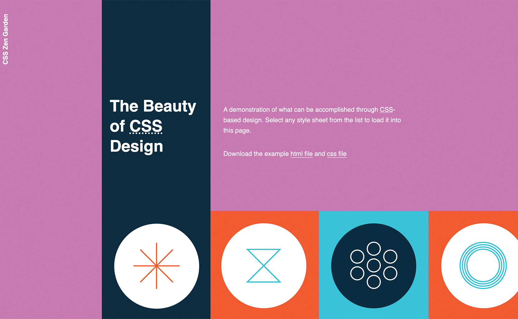
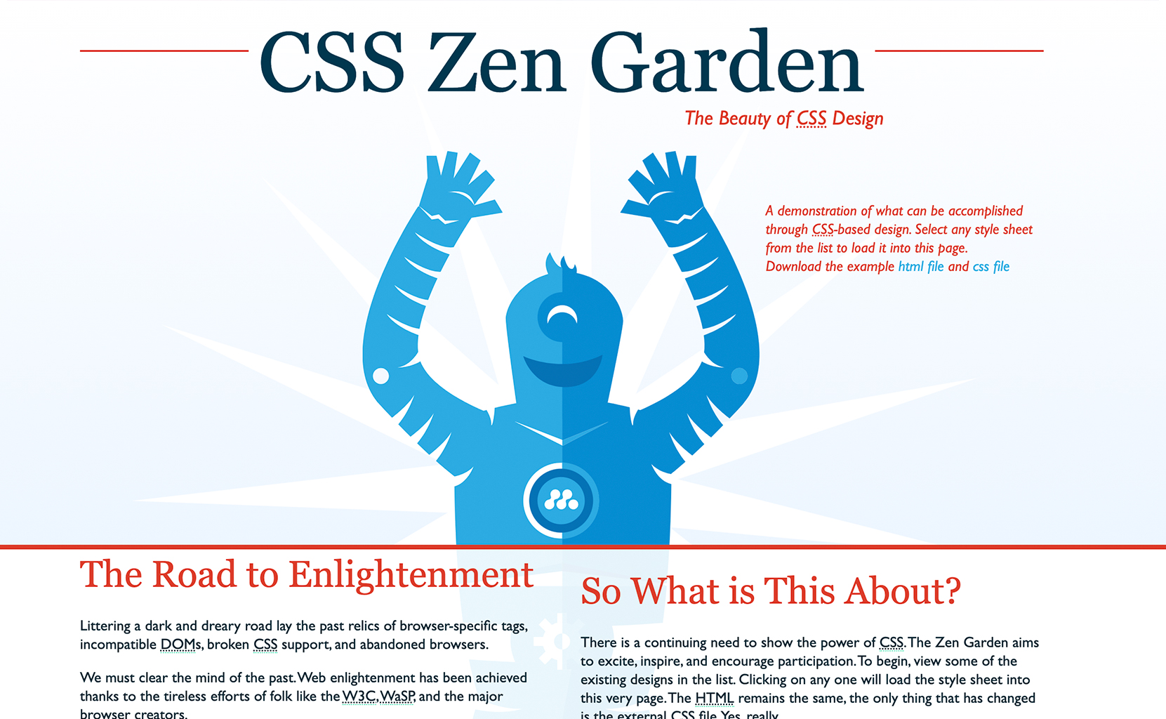
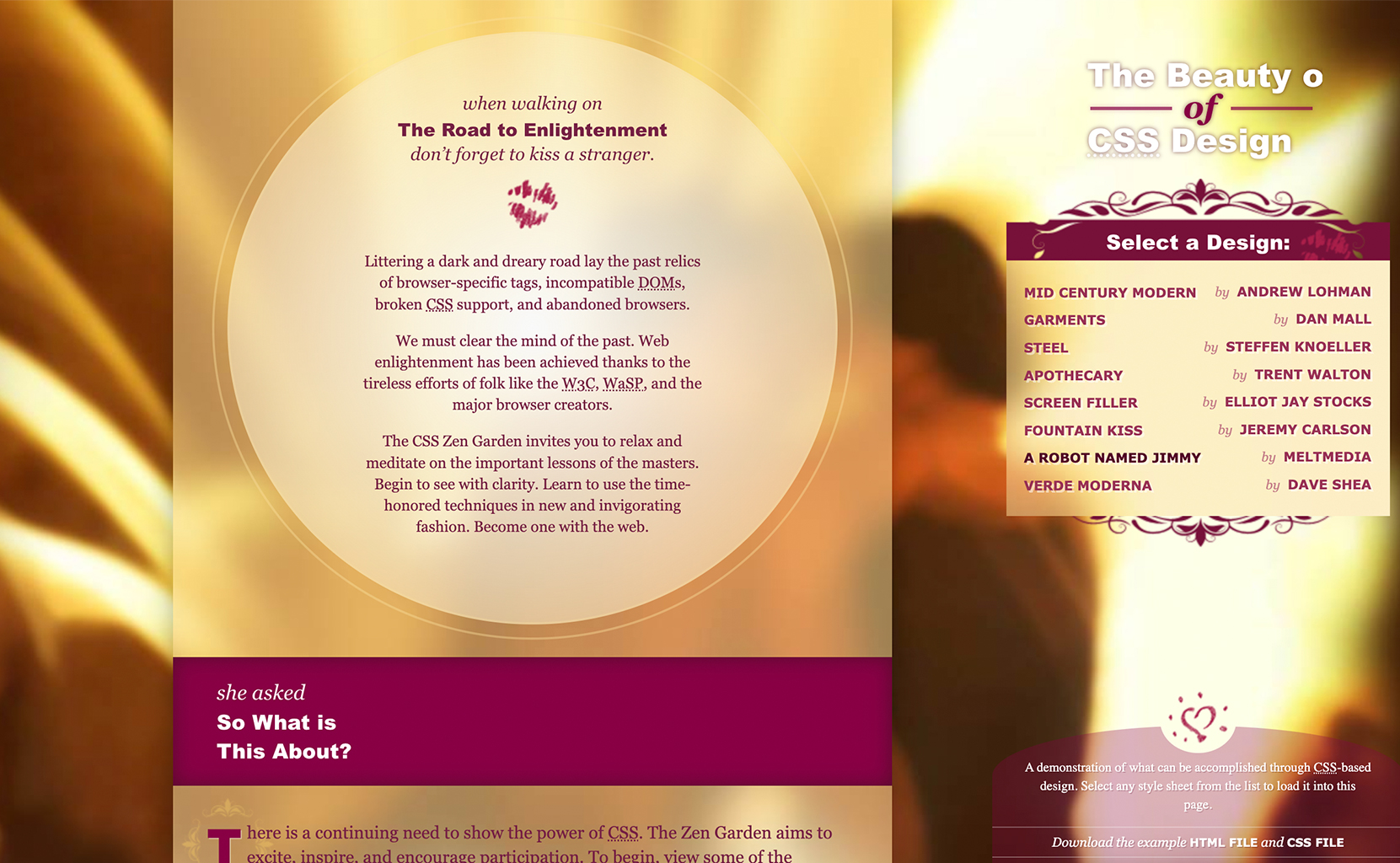
Almost 20 years ago, CSS Zen Garden sprung up as a way to show the power of CSS to those new to the web. You could take exactly the same content, and, completely separately, make as many ‘front-ends’ as you wanted. I don’t mean tweaking a button colour here and there like we tend to get caught up on these days. No, this was absolute and complete wholesale UI change.


Back then, the internet was relatively new, albeit gaining fast momentum, and so us designers were more fixated on making the stuff ‘look acceptable’ – a focus mostly on aesthetics as we battled with early-days HTML table layouts, 1x1px gifs in a world before rounded corners, caveats around which size of monitor and which browser this website would be best viewed at, and ‘sliced’ images if we wanted things to be a little more ‘responsive’. It really was a moment where graphic designers adapted offline content like brochures to the online alternative – brochure websites.
Along came some ‘fancy’ technologies like Flash and, for a brief moment in time, there was a sense of playfulness to people and businesses who had presences online. Things like ‘splash pages’ were the designer’s equivalent to opening movie titles – How might one set the mood of this website with a focus on form before getting to the heart of the content.
As the usefulness of the internet evolved, so too did our focus on and emergence of concepts like ‘usability’ and ‘interaction design’. We did this the best way we knew how – skeuomorphic design – or, taking real-world affordances for things like buttons and tabs, and mimicking them on websites and other digital services so that people understood what to do when they saw a particular interface element. Meanwhile, consultancies like Norman Nielsen were devising principles and practices for ‘best practice UI design’ which, whether you like it or not, still hold true today.
Software and the user interfaces through which we interact are our raw materials and by its very nature, is “soft” – abstract, malleable, fluid, adaptable.
Back then, when the world was a little less connected, most businesses expected people like them to visit. I designed websites for ice cream shops, car dealerships, and other small to medium-sized businesses that were mostly interested in giving people in their local area a way to contact them, and then, a bit later, make a purchase online.
But like a mycelium network, the internet exploded, amplified by the advances in mobile computing. Relatively quickly, humans could see, hear, and feel other humans – everywhere.
One thing I never really see the internet get credit for, at least at a meta-level, is how it accelerated humans’ understanding of one another. Some may call it ‘woke-ism’ but, in truth, the internet exposed, and continues to expose, the diversity of experience that exists across the human race – race, gender, disability, neurodivergence – you name it. I feel like we’ve just scratched the surface, just as the spectrum of light refracted into its various component parts. There are differences in the human race we haven’t even noticed yet.
And, if we’re honest with ourselves, it’s fair to say we’re struggling with that. We’re struggling to ‘catch up’ to this explosion of awareness by way of categorising an ever-nuanced set of human traits in order for us to have a common language for which to discuss our individuality and design a world that’s fair and just for all. Because of the inherent complexity in the infinite diversity of human experience, our brains seem to get lazy so, as a way out, it becomes easier to stick with broad generalisations and proxies for certain values – us vs them, woke vs not woke, informed vs uninformed, left v right. It’s not our fault, it’s just a reaction to the explosive power of the internet and the tools we’ve built to connect ourselves to one another. We are but animals in a rapidly changing habitat.
What’s this got to do with UI?
Well, there’s an opportunity – not necessarily a business one, although some folks will argue it is – for accelerating equality across all humans, and it lives in software.
Let me put it this way. The world is reliant on digital tools and services more than ever, and unless there’s an Independence Day (the movie) level societal collapse, that reliance is not getting any weaker. At the same time, with every day that passes, we are increasing our knowledge and understanding of the ever-growing diversity of the human experience.
See the connection?
There has never been a greater opportunity in human history to create tools and services for anyone. Meanwhile, software (and the user interfaces through which we interact) is our raw material and by it’s very nature, is soft – abstract, malleable, fluid, adaptable.


Why then, if we had the technology back in the late 90s to create completely different interfaces with exactly the same content, do we currently inhabit a digital world where software UI has become as stiff as hardware UI once was?
Sure, OK, I’m not an idiot, I know it’s cost. It costs businesses to build UI and the last thing any business wants is to spend money making ‘multiple versions’ of the same UI – designing, deploying, managing, supporting – especially if ‘target audiences’ are small because the ROI on that investment is likely to be small. For what it’s worth, this argument is the common one used for addressing ‘inclusion’ (or accessibility) if you prefer that term – but my answer is the same – fine, so who’s fixing it and what happens if we don’t?
The digital world talks about personalisation in the context of selling more stuff. It talks about AI in the context of ‘accelerating the commodification of everything’. It talks about ‘inclusion’ and ‘diversity’ in executive round tables where things get so complicated and nuanced that the easiest thing to do is bury heads in the sand or make ‘decisions’ which are, often, not always, empty promises for reform and change. But, as almost anyone in digital (and ecology) also knows – personalisation and diversity are accelerators of all sorts of success. It seems, we’ve decided that it’s just not needed in our interfaces?
Look, I used to code. I used to be able to write HTML, CSS, Javascript, C++, SQL blah blah. And sure, over time, our systems have become more complicated and things have progressed such that the focus has been on scale – the most for the many. React, NextJS, etc and so on promises speed, security, and scale but the problem of personalisation doesn’t fall on the engineer, designer, and product manager working to ship features because ‘that’s a business model problem’. I guess I’m here to ask the obvious question – what if it wasn’t?
What if, instead of prioritising speed and scale in our engineering frameworks, we built humanity in – a way for anyone to customise the way they interact with the services and tools we make?
The overwhelming joy and possibility of my first experience with CSS Zen Garden unleashed in me my love of the digital medium. For the first time, a designer could divorce form from content. We were no longer trapped in A4 document boundaries or DL brochures. We were no longer bound by the 3m x 2m shopfront window – that sign, or brochure, or document could be for anyone. Back then, I’m ashamed to say that I was also completely unaware of the diversity in the audience – their preferences and abilities – but now that I am, I can’t help but wonder about the power that lies within a modern-day CSS Zen Garden approach to building front-ends; not just for the ‘functional’ stuff like ‘accessibility’ and ‘inclusion’ but for the emotional stuff, too.
Maybe I’d buy more if my Etsy experience could look the way I wanted it to look, rather than what’s easiest for the team to maintain internally. Maybe I’d prefer doing my taxes online if I could organise the interface the way I wanted to, rather than what an accountant thought I should do. Maybe I’d have more fun on Instagram (which would lead to higher engagement) if I could change the colours, fonts, and customise the ways I ‘scrolled’ through content because it was just the way I preferred it? What if I could choose and own the interfaces between me and said company/product or service?
What are we doing – the shapers of the building blocks of our digital experiences – to create a world that marries the best of what “Soft UI” can bring (adaptability, changeability, customisability) with the ever-increasing diversity of human experience that we know exists? And, should we, could we, be doing more?
